-Annotated time series graph with Matplotlib about companies I worked for during my eight years in NYC high-rise building exterior restoration/construction. The dataset is from my three-tier real estate warehouse in Google BigQuery sourced from NYC Open Data. The visual displays the contract (job) count per year by company license

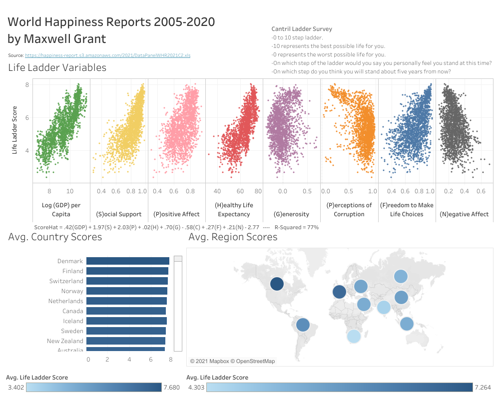
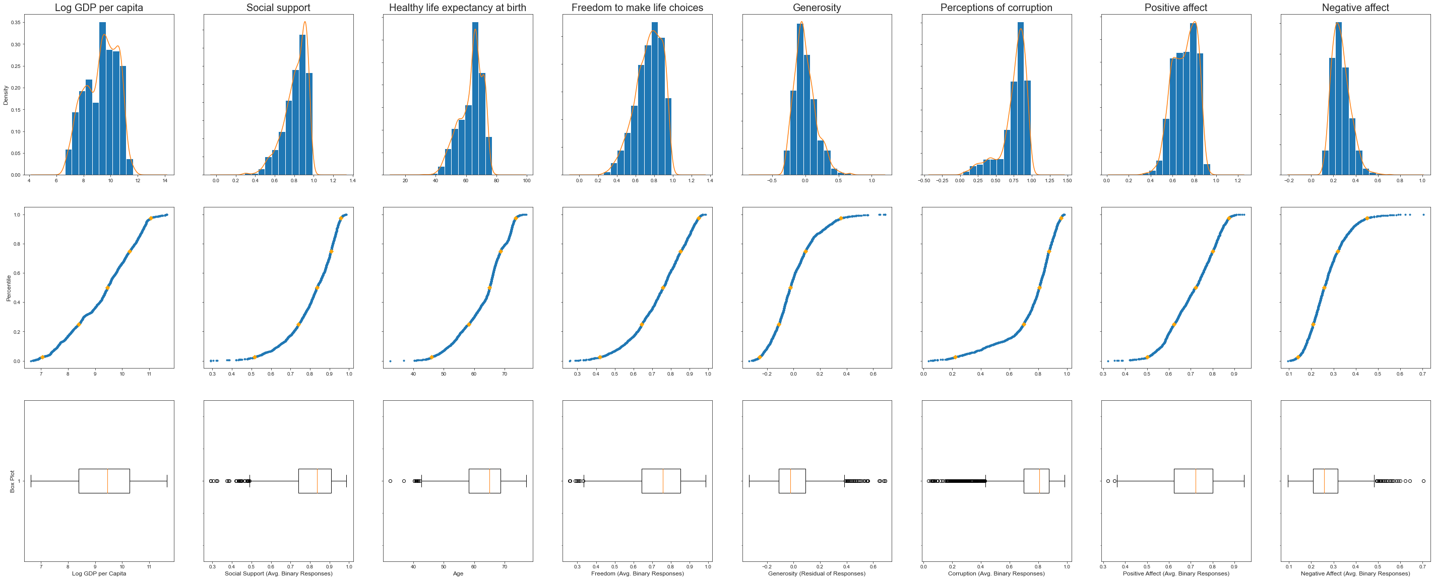
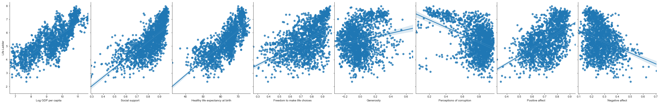
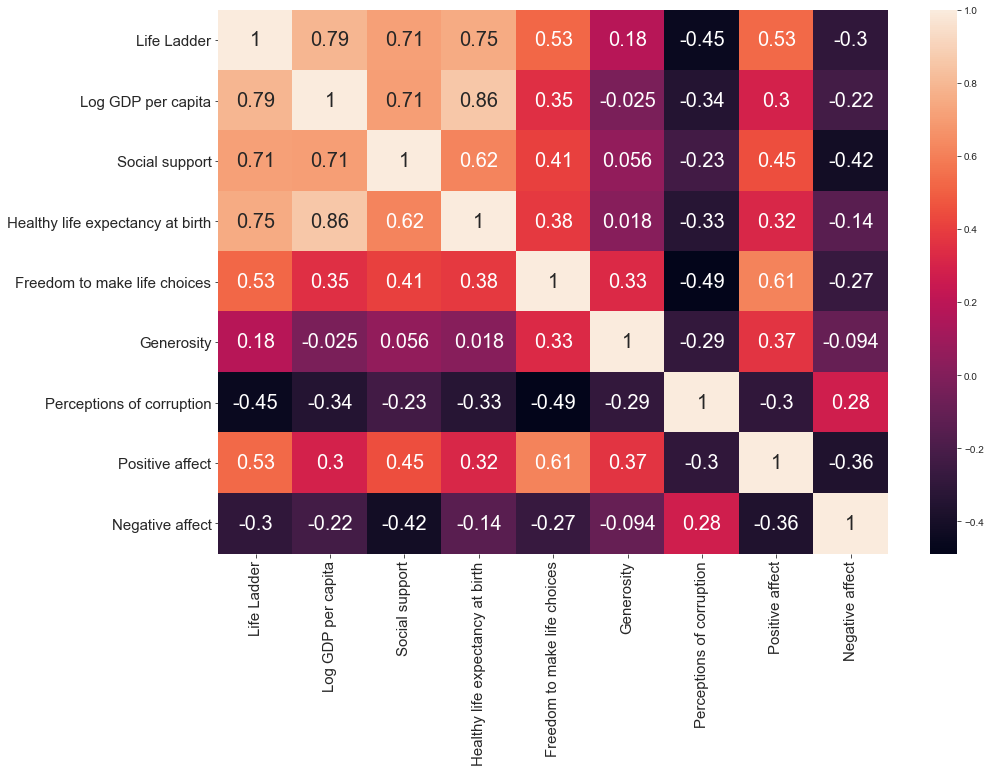
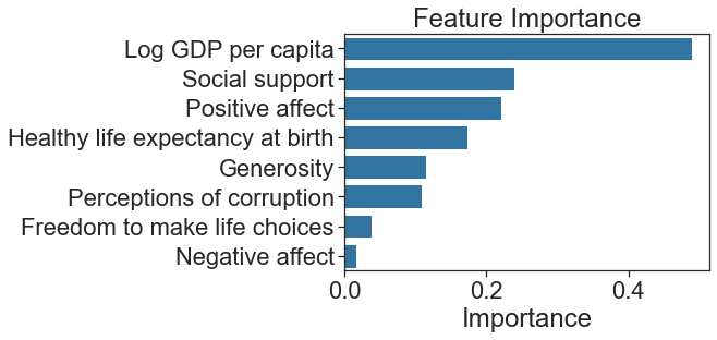
-A Tableau dashboard and a linear regression in a Jupyter Notebook with exploratory data analysis and feature importance.
-Regions, longitude, and latitude added to the dataset.